Designing for the spotlight: Arts and culture projects
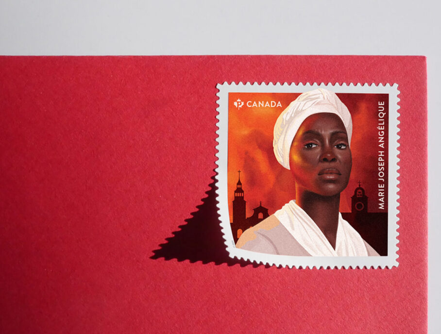 Black History Month stamp honouring Marie Joseph Angélique by Scooter Design
Design gives culture its public face, from a poster in a transit shelter to a sign on a gallery wall. This month, we feature projects by RGD Members that put arts and culture at the centre of the brief.
The projects featured here range from a new identity for the longest-running ballet company in North America and a gallery's identity built around a single letter to the design of an exhibit on how wild rice shaped Anishinaabeg community voices and a community art centre's website. There is also a postage stamp that gives a face to a little-known story, an augmented-reality exhibit, a campaign for a video art distributor, a motion-led identity for an international youth arts program and a self-initiated series of mixed-media art about parenting. Together, they show design at work across the arts.
AR Art Exhibit for Nuit Blanche Toronto by Julian Brown RGD
Julian is an emerging mixed-reality artist who is branching out from his established career as a motion designer. After spending a large part of his life in front of digital screens, he now makes art that critiques technology's dysfunctional influence on people. His medium is augmented reality (AR): digital 3D kinetic sculptures triggered from geometric physical artworks. His process combines 2D vector graphics, 3D animation and interactive spatial design, brought together with QR codes. After a successful small exhibit in early 2026 at Trinity Square Video, a new media art gallery in Toronto's 401 Richmond building, the gallery's staff asked him to prepare a show for Nuit Blanche in October.


For his first solo exhibition of design-infused art, Julian created an inflatable cube installation that triggers four new AR artworks from oversized QR codes. The lowly QR code stops being just a link and becomes the feature presentation, and the exhibit hijacks its visual language as a metaphor for people’s changing struggles with technology and addiction. Viewers experience the works on their own devices, often surprised and delighted by the immersive 3D animations. After the initial rush of dopamine, they may feel anxious or uneasy about the underlying messages, a feeling familiar to doomscrollers everywhere. The exhibition is on now at Trinity Square Video in Toronto until November 14.
Credits
- Mixed-Reality Artist: Julian Brown RGD
- Gallery: Trinity Square Video, Toronto
Berthelet Art Gallery visual identity by Super Studio
Berthelet Art Gallery needed an identity that could strengthen its presence and invite people inside. The challenge went beyond simplifying its visual expression: it meant rethinking how identity could connect the gallery to the street. The architecture provided the starting point. Large windows expose the interior, creating a natural dialogue between looking in and stepping inside, and the design process explored how a graphic form could activate that relationship, functioning as signage, a frame and a threshold.
The letter “B” emerged as the central device. Simple, distinctive and recognizable without relying on language, it offered a shared visual cue for the bilingual community and international visitors. Its scale and placement were developed around the storefront, allowing the identity to become part of the architecture and the visitor experience.


The identity transforms the “B” into an architectural invitation. Applied at a large scale across the storefront windows, it creates a recognizable landmark from a distance and an opening through which passersby can discover the gallery. Its clarity transcends language: “Go see the big B” becomes an intuitive way to identify and locate the space. At night, interior lighting gives the letter a luminous, almost theatrical presence, extending the gallery's visibility beyond operating hours.
The result is an identity embedded in the experience of the place. The façade becomes a point of contact, bringing the gallery into the streetscape and making it easier to recognize, describe and remember. See the project on Behance.
Credits
- Designer: Carolane Godbout RGD
Black History Month stamp honouring Marie Joseph Angélique by Scooter Design
Postage stamps help shape a country's collective memory and culture. For Canada Post's Black History Month stamp honouring Marie Joseph Angélique, issued in January 2025, Scooter Design was commissioned to bring her story to life, connecting Montréal's history with the little-known history of slavery in Canada. Angélique, an enslaved Black woman, was accused of setting the Montréal fire of 1734 and was convicted and executed, although none of the witnesses at her trial is believed to have seen the crime. Historians remain divided on whether she was responsible.
With no known portrait, the challenge was to give Angélique a human presence. Historians and researchers engaged by Canada Post provided references for period clothing, fabrics, headwear and what is known of her life. Scooter Design selected photographer Jorge Camarotti and actress Penande Estime, directing a photo shoot that explored fear, anger, pride and defiance. Illustrator Alexis Eke used the selected photograph to develop a historically grounded portrait, adjusting for Angélique's approximate age while retaining her expression.


The illustration pairs a photorealistic face with flat, vector-like clothing and headdress, focusing attention on Angélique's expression. Her direct gaze conveys dignity and resolve. In the background, silhouettes of buildings appear against an orange sky that evokes both her spirited character and the fire, while her portrait extends beyond the frame, emphasizing her heroic stature.
Across the stamp booklet and Official First Day Cover (a collector's envelope), historical imagery meets contemporary graphics. The booklet's fluorescent yellow flame expresses her personality and symbolizes resistance and the desire for freedom, connecting her defiance to the broader struggle of enslaved people for liberation. Archival views and a map locate the story in Montréal, with graphic flames marking the devastated area. A cancellation mark depicting a burning house completes the collection. Grounded in historical research, the design places Angélique within Canada's commemorative landscape, portraying her with the strength, dignity and humanity she was denied in her lifetime.
Credits
- Design, Art and Photo Direction: Nathalie Cusson, Scooter Design
- Design Director, Canada Post: Gary Beelik
- Illustration: Alexis Eke
- Photography: Jorge Camarotti
- Actress and Portrait Reference: Penande Estime
Canadian Museum for Human Rights rebrand by Humanity Agency
Ten years after opening, the Canadian Museum for Human Rights partnered with Humanity Agency to rethink and refresh its brand. The original symbol depicted the Museum’s distinctive architecture, a fitting introduction when the building was new. A decade later, it was time for a symbol that spoke to human rights themselves.
Research, stakeholder engagement and strategy grounded the rebrand. Two qualities guided the design: the connection we feel through our shared humanity and the defiance needed to stand up for one another. Accessibility was a non-negotiable foundation, shaping how the identity would be read, understood and experienced. Comprehensive guidelines were developed with the Museum’s team to provide a clear framework and flexibility for growth.


The new symbol retains an architectural connection while expanding its meaning. Rays of light extend from a shared origin, expressing solidarity, strength and hope. An expanded palette with black and yellow at its core echoes the Museum’s journey from darkness to light, as visitors ascend backlit alabaster ramps toward the light-flooded Tower of Hope. The identity extends from large-scale signage to digital apps and souvenir shop labels, with motion, sonic branding and sub-brands for the Museum’s community initiatives and programs.
Credits
- Chief Creative Officer: Carolyn Shaw
- Chief Strategy Officer: Ryan Hughes
- Executive Creative Director (Design): Nathalie Cusson
- Senior Designer: Bernadette Funk
- Executive Creative Director (Writing): Bryan Hobson
- Copywriter: Shairina Brown
Islands in the Stream: promotional materials for Vtape's 19th Curatorial Incubator by Acme Art & Design
Vtape, a video art distributor that represents an international collection of contemporary and historical video art, documentaries and installations, commissioned Acme to design a campaign for its Curatorial Incubator v.19 program. The challenge was to visually express the themes of two screenings of projects that explore collections, how they are accessed online as never-ending digital repositories and how the stream can be interrupted to create new moments for refuge.


The campaign design reflects the program's thematic exploration of traces, accidents, disappearance, change and reconstruction through lettering illustrations created by manipulating text by hand on a flatbed scanner. The work includes posters and publication pages.
Credits
- Designer: Michael Barker RGD
Latcham Art Centre website by Paul Jen Communications
Founded in 1979 by local artists, the Latcham Art Centre spent four decades as a small community gallery in Whitchurch-Stouffville, Ontario. In 2018, it moved into a purpose-built home at the Stouffville Leisure Centre with a broader public mandate: 12 exhibitions a year, school and studio programming, community shows and a town-wide public art collection. Its website still spoke for the storefront gallery it used to be.
The brief was not a rebrand, and the name and identity stayed. The design team worked with gallery staff to clarify Latcham's market position and value proposition, then rebuilt the site as the front door of a civic arts institution. The structure was organized around the people who use it: visitors planning a trip, families registering for programs, artists submitting work and partners and funders looking for evidence of reach. Decisions were validated with gallery staff, the board and community audiences before build.


The result is a website sized to Latcham's mandate rather than its history. The interface stays deliberately quiet, with restrained typography, generous space and full-bleed installation photography, so the artwork leads. A permanent, searchable archive preserves 80 exhibitions that previously lived in print catalogues and staff files. A self-guided route connects the murals and sculptures sited across town, extending the gallery beyond its walls. Class registration and payment now happen on the site, and custom content types let a small staff publish complex, image-heavy records without developer support.
According to the studio, visitors and acquisitions have increased 200% since launch, and families now complete registration on their own. The site received a 2026 dotCOMM Gold Award.
Credits
- Art Director: Paul Jen
- Art Director: Sara Karges
- Designer: Sara Karges
- Designer: Wenjie Zhu
- Developer: Sara Karges
- Content Strategist: Paul Jen
- Content Strategist: David Lambert
- Content Strategist: Jennifer Onlock, Latcham Art Centre
- Project Manager: Paul Jen
- Intro Video: Paul Jen
Mammalian Droppings: A global seed exchange for artistic ideas by Acme Art & Design
Mammalian Droppings is a new international ensemble and production model for young creators, created by Mammalian Diving Reflex, a Canadian artistic collective. The program travels between cities, bringing together emerging artists and local communities. Acme Art & Design created a motion-first creative identity and communication materials for it.


The new program is complex to describe, and the materials needed to make it easy to understand and compelling to two very different audiences: institutional partners and young participants. The centrepiece is a playful motion graphics explainer video that answers the question “What is this chaos?” with animated diagrams and a cheeky voiceover.
Credits
- Designer: Michael Barker RGD
Manoominike: A Living History by Ben Wu RGD
The Canada Agriculture and Food Museum developed Manoominike: A Living History for its Sustainable Agriculture Gallery to explore the cultural and ecological relationships between manoomin (wild rice) and Anishinaabeg communities around Rice Lake and Chemong Lake. The exhibition centres on community knowledge and ongoing efforts to restore wild rice beds.
Working with the museum's curatorial and interpretive teams, Ben translated bilingual content into a spatial storytelling system. His process included visitor-flow planning, thematic zoning, information hierarchy, 3D visualization, full-scale layout studies, material tests and production artwork. Photography, moving images, maps and illustrated harvesting activities were integrated into an exhibition environment designed to support the stories shared by Knowledge Keepers and community contributors.


The completed exhibition guides visitors through language, landscape, ecology, gathering, processing and cultural revitalization. Colour-coded zones and full-height environmental imagery establish orientation, while oversized headings, raised content panels and illustrated gestures offer information at different viewing distances. Bilingual labels, a map, projection and supporting QR content add layers of interpretation without competing with the featured community voices. Ben carried the graphic system from concept and 3D simulation through print-ready artwork, fabrication coordination and installation support.
Opening in 2026, the exhibition presents wild rice not simply as a crop but as part of an ongoing relationship among people, land and water. The design gives visitors a coherent setting in which to engage with living cultural practices and community-led restoration efforts. Read Ben Wu's case study on LinkedIn.
Credits
- Exhibition Design, Graphic Design, Spatial Planning, 3D Visualization and Production Artwork: Ben Wu RGD
- Curator: William Knight
- Exhibition Project Manager: Marc Beck
- Exhibition Interpretive Planner: Hannah Wisniowski
- Installation: Shannon Camp
- Photography and Film: Shelby Lisk
- Featured Community Contributors: Jeff Beaver, Caleb Musgrave, Ryerson Whetung and Janet McCue
Parenting Series: Growing Art Collection by IS Design Labs
Parenting Series: Growing Art Collection began as a self-initiated side project, a mixed-media series created to find fresh creative inspiration and spark honest conversations about the unspoken realities of parenting. Moving away from digital client briefs, designer and artist Iliana Sergeev RGD experimented with unfamiliar physical materials, including felt, plexiglass, infinity mirrors and LED signs. Ordinary domestic objects, such as toy blocks and a child's phonetically misspelled note, become dimensional, conceptual art set against raw themes of postpartum vulnerability. The collection documents the unseen emotional labour of caregiving and serves as a physical archive of fleeting milestones, challenging polished narratives of domestic perfection.


Turning private, domestic vulnerability into public art has built connections with viewers and validated the unvarnished experiences of parenthood. One piece was acquired by the permanent art collection at Michael Garron Hospital, where it gives patients and families a visual anchor for empathy and a safe space for reflection. The series continues to grow, with a sixth piece, showing that self-directed projects can carry real cultural weight and open public conversations about mental health and caregiving.
Credits
- Artist and Designer: Iliana Sergeev RGD
Royal Winnipeg Ballet by Bruce Mau Design
The Royal Winnipeg Ballet is the longest-running ballet company in North America. With new leadership and a fresh artistic vision, the company needed a brand that could signal the changes taking shape. Bruce Mau Design (BMD) was asked to bring that ambition to life and recapture audiences through a new strategy, logo and brand identity and digital footprint. The team studied the company's rich history, including its Prairies setting, its unconventional beginnings, the ambition of its leadership and the desires of its community, all of which shaped the new brand platform and visual expression.


The identity centres on a logo with a graphic W that stretches in position to signal Winnipeg's pride of place and the company's instinct to challenge conventions. The W and “Winnipeg” are colourized in the long-form mark to give the city the presence it deserves, and that gesture carries through a variable typeface that brings dynamism to everyday communications. The core palette separates the ballet company from the ballet school, using black to draw on the performance environment and white to pull from the school's studio spaces. A vibrant blue inspired by the prairie sky is the key brand colour, and in marketing communications, the key colour comes from the photography of each production. BMD also partnered with digital agency Plank to design an immersive website that improves usability and accessibility.
Credits
- Chief Creative Officer: Laura Stein RGD
- Design Director: Karol Dybalski
- Graphic Designer: Brendan Irving Associate RGD
- Graphic Designer: Dan Rivera
- Motion Designer: Jisung Park
- Web Designer: Marc Lauriault RGD
- Director of Design Strategy: Kar Yan Cheung
- Account Director: Marla Garderis
- Web Design & Development: Plank
- Photographer: Danny Shumov
Tag
Related Articles






Sponsored